Hyperswitch, Control Centre
Hi there! Thanks for dropping by. I am Mehak Samaiya, Product Designer @Juspay.In this case study, I'll walk you through our journey in designing the Control Centre (or dashboard) for Hyperswitch, the global venture of Juspay.
HyperSwitch is the global venture of Juspay aiming to simplify payment orchestration by being an Open Payments API. Our vision is to make payments open, cost-effective, and fast for the global audience by giving merchants total control over the source for payment processing. Hence, the name of our dashboard - Control Centre.
Insider : We initially named this Global venture of Juspay as Orca - the killer whale residing on top of the food-chain. Our team conceived Orca as the topmost layer of a multiprocessor payments stack, similar to orca in the food-chain.
When I took hold of Design in HyperSwitch (Dec 2022), I had already worked a fair amount in Juspay Dashboard in various modules including payments, gateways, routing, and operations. So, safe to say, I understood what Indian businesses expect from payment orchestrators. But since we were going global, many things changed about our target users (merchants) and their target users (you and me). The team was still in early stages of product strategy and hence, ideas bubbled up and boiled down quite frequently. And I was thirdwheeling as the only designer in a tribe of developers and PMs 🫣.
We got early traction from Github, Reddit, and word of mouth. At this point, we didn't have a dashboard to offer. I started observing the lead calls/notes to understand users, their expectations and pain points with current solutions.
Talking to users is not enough when you're in the early stages of a product, you need to be deep in the game - just as much as the people who planted the product seed. What are they thinking? Why do they believe in the product so much? What problem do they think they're solving? Is that even a problem? I feel Designers are weird creatures. We can keep listening to a problem while questioning the existence of that problem AND simultaneously brewing solutions for it, all at the SAME time.
Initial conversations with users and some desk research taught us that orchestration is still a less explored domain in western markets. Most small businesses are okay to rely on one of the top processors like Stripe, Adyen, Braintree, etc. to deal with everything payments so that they can focus on their actual business. But with growing volumes, businesses need to integrate with multiple Payment Processors to cater to the diversity and reduce dependency on a single payment processor; eventually spiking up the overall payments cost and occupying human resources. While all the cost related issues could be solved by using a single HyperSwitch API, we realised there was still a major (obvious) hole in the experience:
To be honest, working on an empty canvas is just as exciting as it is overwhelming. I'll give you full disclosure, Juspay doesn't really believe in wireframing on pixels. We are a highly prototype first company. Over time, this continuous practice has shaped my approach towards design and forced me to have a far sight towards all types of experiences, be it a small devil-like detail or an extremely complex flow. So, when all the product discussions happened, I had ideas floating around my head in the BTS about stitching an interconnected experience. I used pen and paper to diverge on these ideas, primarily around content and IA.
Being the only designer in the team, I used to sit in-person with other designers to quickly get raw feedback on the UI. This helped me stay grounded and avoid blockers. Ironically, a lot of critical feedback came when I asked folks to experience the flow without context.
The usual practice for Design x stakeholders (PMs, devs) in Hyperswitch was (is) very collaborative. We intentionally avoid a transactional relationship of design with other pods because that delays valuable feedback and unnecessarily increases back and forth. Feedback usually starts on a slack thread and escalates in the form of meetings incase of disagreements or misunderstandings.
We ran minor walkthru tests (sometimes open-source) on objective discussion like vertical vs horizontal parent nav and dark vs light mode.
Dark mode attracted a lot of eyeballs, and a few leads :p. But failed to be usable. Every now and then users had to increase the brightness to focus. Users felt like it was a web3 product. Too vibrant, prolly? Making it a greyish dark faded (killed) the glassmorphism vibe. Hence we dropped the dark mode, instead of iterating on it further.
We also had to eliminate the horizontal nav option because of scalability reasons. I was more inclined towards a horizontal navigation for the very same reason. I believed the real estate constraint would always force us a thoughtful grouping of modules. But seems like the vertical nav felt more comfortable to the users.
I was going through the talk of Yuhki Yamashita: Confessions of Modern Design (Welcome to the WIP) and had my moments of truth and crisis regarding this project. I've had immense fun and innumerable productive conflicts while designing the modules of Control Centre. I've had spent some crazy nights on ideas that didn't see the light of the day. I've spent hours on details even I wouldn't notice as a user, and still believe it's a WIP. As Yuhki says, every thing is always a WIP and that is exactly how we evolve!
Would like to know about this project or my work? Hit me on mehaksamaiya@gmail.com or DM me on Twitter.
Special thanks to Manoj, Deepak, Samit ++ everyone in the HyperSwitch team. I couldn't be more grateful to you folks for roasting *and* appreciating my designs constantly! Onwards and upwards from here :)
After a couple of rounds of feedback, we landed on the following core principles of Control Centre (keeping in mind it was an Open-Source product):
1. Control, Visibility, & Actionable - first
2. More visual less text-y
3. Comprehensive and self-service
4. Data-centric
As we progressed, I started iterating on the UI. Some major design decisions were totally left open ended like dark vs lite mode, type of navigation, the overall vibe (flat, floating, glassy, etc). And so, I started my exploration. Ngl, my favourite part 🫶🏽.
User can't keep switching between different platforms, tools, or for that matter keep querying in Grafana to be aware of their payment health. We needed a central experience to bridge this hole. This central experience can then be used across teams to control different aspects in and around payment processing.
Hence, we sat down to write down the vision and crux of the Control Centre along with an IA. We drilled down to 3 types of users:
1. Developers
2. PMs
3. Customer Success folks
Anyway, being a part of the discussions, directly/indirectly related to design, has been a critical part of my overall workflow. I kinda consider it my special power, thanks to the extrovert within me :p
There was no central place for merchants to monitor the payment health or exercise control over the processing of these payments. In short, there was no face to the API.
About HyperSwitch
Setting up context
Listening, talking, and being a part
Iterations and explorations
Users and key problems
Hello paper, hello idea
Design reviews and stakeholder meets
Converging to a style
Moments of truth
Reached this far?!
Playing around pixels
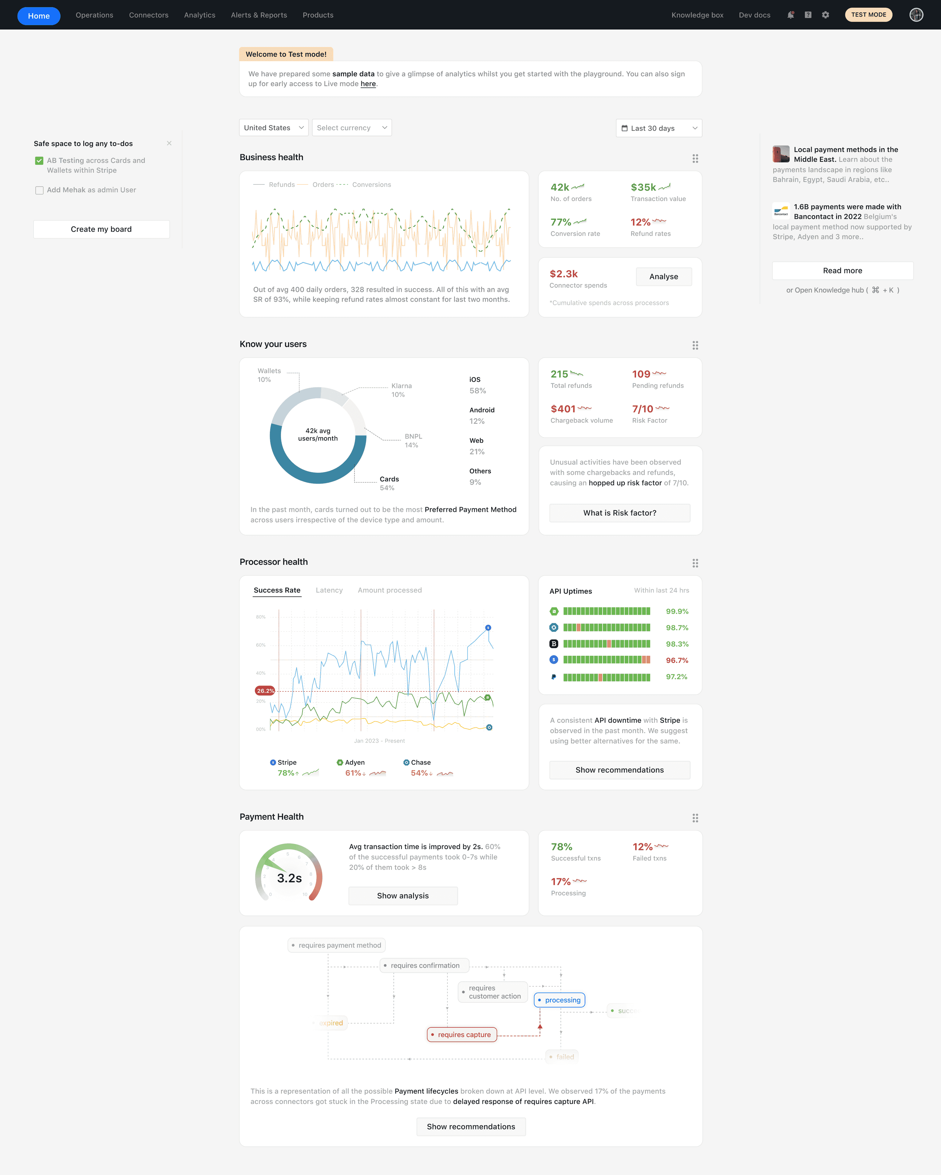
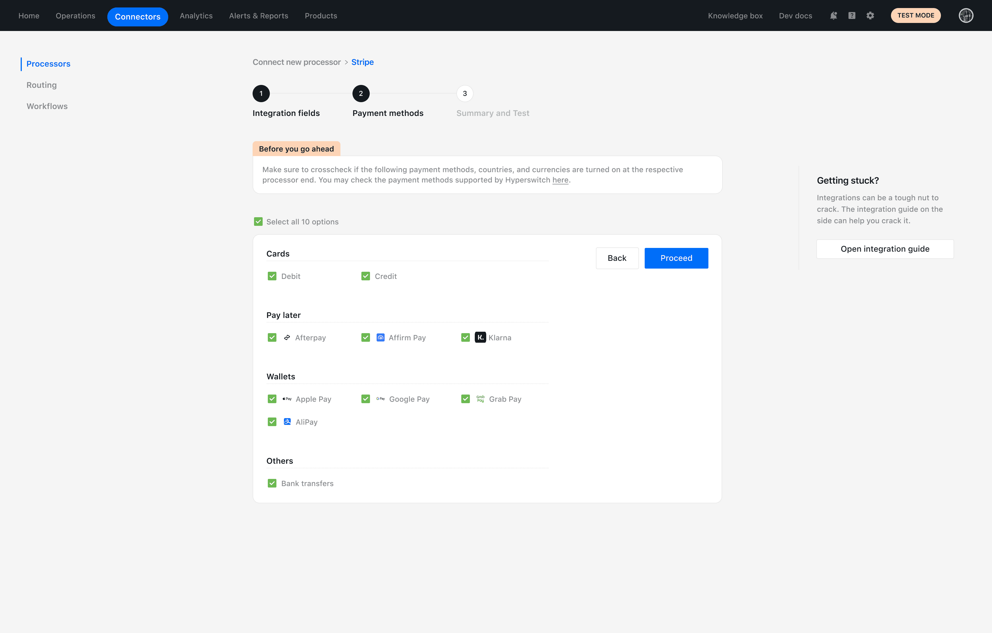
Little glimpses of the Control Centre modules
Basic user journeys/ inspiration dump to get started with wireframes (Confluence)
I could've put some lorem ipsum and random visuals for starters, but it's harder for team to comment or collaborate on dummy content. Hence, I had to be extremely careful on what I put on early drafts.
Early wireframe drafts of Home page majorly focused on getting the content right
We developed a practice across devs and PMs to always try out designs in Figma web mirror to actually experience all real interactions/flows. This made it easier for them to provide contextual feedback.
Btw, Our (WIP) product is **LIVE** and open to use. Get your hands dirty at app.hyperswitch.io! We'd appreciate any and all feedback you have for us.
After multiple rounds of feedback and taking inspiration from ops and data heavy tools, we landed to a style that felt just right - flat, abstract, bit sharp, data heavy yet clean, boxy.
© Mehak Samaiya. 2023 | Made with love and colors in Framer